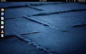
The Gnome 3 desktop has been controversial since its release last year, with many Linux users disagreeing with the design decisions of the Gnome Team. Personally, it has been my favorite desktop environment in the past year. I think most people agree that the empty desktop that Gnome 3 boots too is a bit odd.
Rather than being able to do anything productive, you have to click the Windows Key or move your mouse to the top right corner of the screen in which will reveal a quick launch dock, a link to your to other apps and any open Windows.
There are plenty of available Gnome 3 extensions which allow you to customize the Gnome 3 desktop experience, even allowing you to bring it back to something more like Gnome 2.
I like the stock Gnome 3 experience well enough so I just made minor changes which tweak it in a way I like better. I used the Dash to Dock extension so that the quick launch dock would always be visible unless I run an app full screen. So, when I boot into Gnome 3, this is what I see.
I also reduced the size of the icons on the dock.
There are 156 extensions right now, which can customize Gnome 3 in different ways, with more being added with each passing week. If you are a Gnome 3 user, give the extensions a look.


I installed Ubuntu 12.04 a few weeks ago after being a windows user since forever. I first tried the unity desktop, which was ok. I personally don't like GNOME 3. I can't point my first as to why... Now I'm using GNOME 2 with cairo dock. My desktop looks like an OSX. I guess I'll stick to this for a while and see.
ReplyDelete